About This Site
Artworks Nation is an informational page for artworksnation.com. It is a place to read about the site and follow whatever is published here as it grows.
Content is presented in short, clearly separated blocks: notes and updates, a closer look at the people and practice behind the work, a look at how it has been covered, and a media panel with supporting imagery.
Artworks Nation exists as a gathering place for creatives, a corner of the internet where artwork is discussed, shared and revisited. Rather than a shop or a portfolio service, it behaves more like a community noticeboard: a place to publish notes, updates and observations, and to follow what appears there as the archive grows over time. The tone is informal and direct, in keeping with a site that seems run by people who make things and enjoy talking about them.
The homepage is organised into short, clearly separated blocks, so a visitor can pick up the thread in a few seconds. One column collects notes and updates, with the newest additions to the artwork archive listed first. Another takes a closer look at the people and practice behind the work. A third gathers press and review coverage, arranged like a collage rather than a formal list, and a media panel of supporting imagery closes the loop visually.
Biographical notes appear alongside circular portrait thumbnails, giving the people behind the work a visible presence without interrupting the flow of the writing. This is a recurring idea across the site: artwork is never presented as detached from the person who made it. The circular cutouts, badge-like graphics and striped backgrounds all point the same way, treating the page like a printed sleeve or gig poster rather than a stripped-back modern interface.
The visual identity leans heavily on a retro rockabilly palette. Deep black provides the ground, with coral and salmon red carrying most of the energy, balanced by teal-green and softened with cream and pink candy stripes. Mustard yellow is reserved for callouts, the moments where the eye needs to be pulled in. Depth comes from flat colour blocking rather than shadows or gradients, which keeps everything feeling printed, tangible and deliberately graphic.
Typography does much of the heavy lifting. Headlines and the logotype are set in a bold condensed display sans-serif, the kind that shouts from across a room or from across a street, while a script or brush accent font adds a hand-painted flourish to the wordmark itself. Body copy stays in a plain system sans-serif for legibility, and the whole site commits to sans-serif forms, leaving serifs out of the picture entirely.
Layout density is high on purpose. Vintage badges, arrow-shaped calls to action and record-label artwork appear as imagery blocks rather than flat interface elements, so scrolling feels like turning through a stack of sleeves and posters. Horizontal striped bands divide one section from the next, and thick coloured borders frame buttons and arrows. Corners are mostly sharp, with only a slight rounding on the buttons and arrows to keep them inviting without softening the overall edge.
Content here spans the wide territory of creative practice: archives of artworks, personal notes on how things were made, reflections on style and the years that shaped it, and accounts of how the work has been received elsewhere. There is space for lighter threads too, the everyday subjects and hobby interests that fill a life between projects. A newsletter and profile features suggest an ongoing relationship with readers rather than a one-off visit.
A bold flat-colour banner strip closes the page, giving it the finality of a back cover or a poster footer. It is a deliberate end note, and it leaves the impression of a site that values atmosphere as much as information. Anyone arriving for the first time is encouraged to wander through the blocks, read the notes, look at the people behind the work and see where the archive is heading, then return when something new has been added.
Notes & Updates
- Latest additions to the artwork archive are listed at the top of this column.
- Biographical notes appear alongside circular portrait thumbnails.
- Press and review coverage is grouped as a collage of cover-art images.
- Supporting media, including artwork and video previews, sits in the right-hand panel.
The People Behind the Work
A short biographical section introduces the individuals connected to the artwork held on this site. Portrait thumbnails are shown as circular cutouts below.
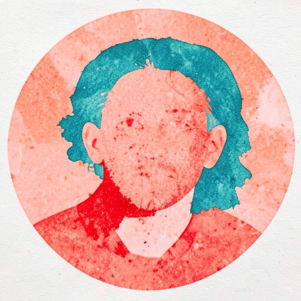 Contributor A
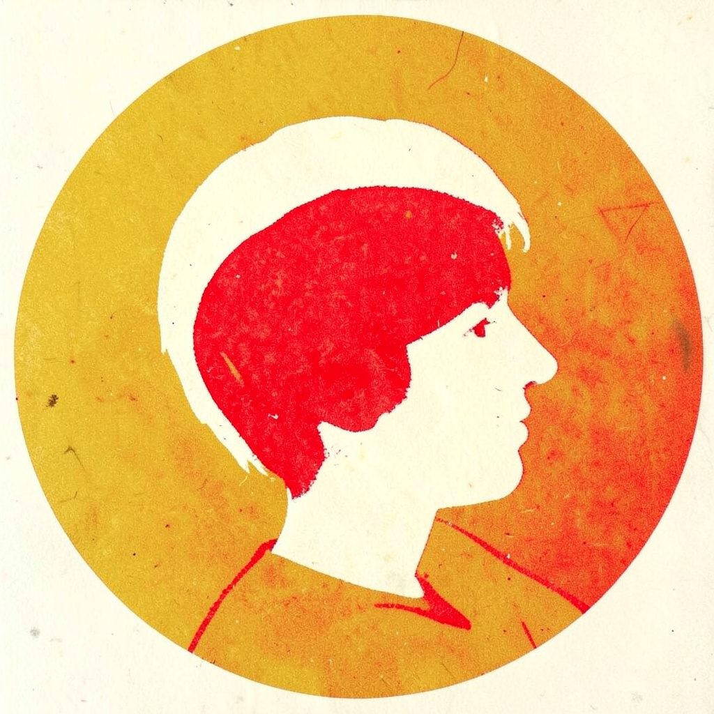 Contributor B
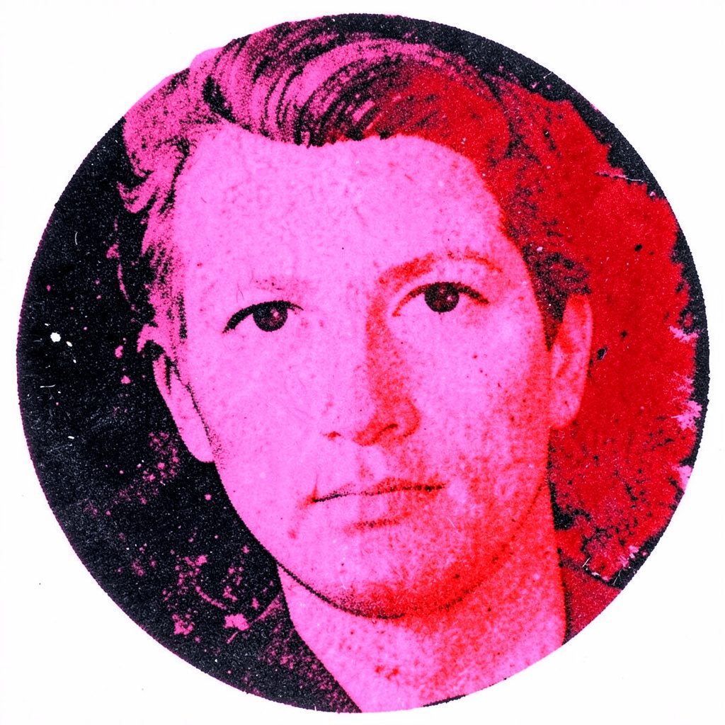 Contributor C
Press & Reviews
Coverage of the work is represented as a collage of cover-art images collected from published features.
Label Mark
Artworks Nation
Reference
| Item | Detail |
|---|---|
| Site | artworksnation.com |
| Page | Home |
| Sections | About, Notes & Updates, People, Press & Reviews, Media |
A Note on Contact Details
Email addresses published on this site are protected against automated harvesting, so a contact link may take a moment to reveal a readable address once your browser is ready.